Call to Action (CTA)
CTA definition
A call to action, or CTA, is a marketing term used to describe a sentence (usually a short one) that serves to encourage users to execute some target action (to subscribe, buy, follow, etc.). CTAs are attractive and eye-catching to lure users’ attention[1].
CTA forms
In online marketing, CTAs may look different depending on the type of platform and means of advertising[2]. For example, a CTA may be:
- Put at the end of the text post;
- A part of the image/video attached to the post;
- A clickable button;
- A pop-up appearing on the page;
- Slide-in banners;
- Independent content blocks.
In traditional advertising, CTAs may be placed on printed ads, TV, or radio announcements.
CTA goals
Usually, the goal of a CTA is to generate conversions, i.e. to encourage users to buy, subscribe, etc. Sometimes CTAs may be used not to covert but to complement a conversion. For example, grow brand awareness, generate leads, enroll in an email list, follow accounts on social media, etc.
CTA best practices
The success of CTAs depends on many factors — you cannot just think up a piece of content, place it somewhere at random, and consider the job done.
To make your CTAs really useful, consider the following:
- A CTA must look native. This means that a step that a CTA encourages to do should be natural after what a user did before. For example, if you send users an email with a new blog post announcement, then a button saying Read now or Learn more is a good CTA.

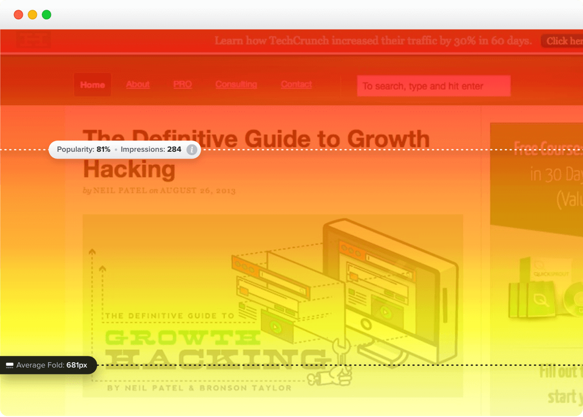
- A CTA must be placed properly. You should place CTAs on the most viewed parts of your pages to make most of your visitors see them. You can use different heatmap tools to determine what parts of your pages attract more attention than others. For example, Crazy Egg can help you:

- CTAs must be short. People do not want to read long texts to find out what they need. They need the information to be short and clear. When working on your CTAs, prefer short texts like Buy now, Read here instead of Learn how to get rid of rust at…
- Think of wording. In addition to short forms, CTAs should be formed properly to encourage action. In most cases, CTAs are written as imperatives (Buy now, Shop now, Read). Another good practice is to write CTAs in first person (I want a demo, I want a call, Send me my book).
- CTAs must have an outstanding design. Although it is important to stick to your brand style, CTAs should still stand out to attract attention. Use colors that do not repeat those on the page, and try bigger fonts or images.


